Today an R-sig-phylo participant asked the following:
I wonder whether anyone of you has a code for phyldataplot (or any other
plotting function) that allows for plotting the distributions of variable
(e.g., boxplots) next to the phylogeny giving something like:
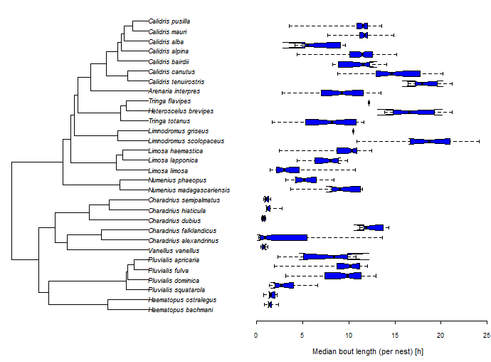
The easiest way to do this is by plotting the tree & the boxplot side-by-side
using par(mfcol=c(1,2)). Here is a demo in which I start by
simulating data. The most important aspect of the simulated data here, though,
is that I end up with a vector in which the (non-unique) names are the
species/tip name for each sample:
library(phytools)
## simulate tree
tree<-pbtree(n=26,tip.label=LETTERS[26:1])
## simulate species means
x<-fastBM(tree)
## simulate individual samples, 5 per species
xe<-sampleFrom(x,setNames(rep(0.5,Ntip(tree)),tree$tip.label),
    setNames(rep(5,Ntip(tree)),tree$tip.label))
round(xe,3)
##      Z      Z      Z      Z      Z      Y      Y      Y      Y      Y
##  1.332  2.062  1.340  0.028  0.158  0.233 -0.458  0.155  0.664  1.022
##      X      X      X      X      X      W      W      W      W      W
## -1.464 -0.468 -0.327  0.743  0.477 -0.509 -1.929 -1.333 -1.105 -0.175
##      V      V      V      V      V      U      U      U      U      U
## -0.572 -0.416  0.056  0.837 -0.200 -0.602 -0.163 -0.095  0.677 -0.691
##      T      T      T      T      T      S      S      S      S      S
## -3.406 -1.735 -2.524 -1.322 -2.391 -3.102 -0.952 -2.573 -1.167 -1.335
##      R      R      R      R      R      Q      Q      Q      Q      Q
## -1.538 -0.969 -2.037 -1.590 -2.223 -2.728 -2.705 -3.732 -1.568 -2.542
##      P      P      P      P      P      O      O      O      O      O
## -3.112 -3.177 -2.963 -3.172 -2.392 -3.366 -2.585 -3.139 -2.782 -2.415
##      N      N      N      N      N      M      M      M      M      M
## -4.072 -3.099 -4.287 -4.789 -4.529 -2.287 -2.402 -2.860 -2.409 -2.926
##      L      L      L      L      L      K      K      K      K      K
## -3.011 -2.681 -3.285 -2.895 -2.750 -1.213  0.809 -1.109 -1.344 -0.418
##      J      J      J      J      J      I      I      I      I      I
##  0.644  1.235  1.863  0.835  1.143 -0.008  0.782 -0.876  0.502 -0.321
##      H      H      H      H      H      G      G      G      G      G
##  1.241  2.049  1.237  2.117  1.292  1.107  0.326  0.261  0.557 -0.968
##      F      F      F      F      F      E      E      E      E      E
##  2.220  0.219  0.056  0.900  1.534 -0.133  1.621  0.079  1.619  0.413
##      D      D      D      D      D      C      C      C      C      C
## -1.604 -2.310 -1.639 -2.355 -1.585 -3.242 -2.904 -3.319 -4.236 -2.767
##      B      B      B      B      B      A      A      A      A      A
## -3.133 -3.714 -3.423 -3.249 -3.736  0.138  0.197 -0.727  0.150  0.817
If we had, for example, a data frame in which one column was species and another was the trait value, we could for instance simply compute:
xe<-setNames(data$trait,data$species)
to the same effect.
OK, now with these data in hand, let's generate our plot. The details are important here to make sure that our horizontally plotted bars line up with the tips of the tree:
par(mfrow=c(1,2))
plotTree(tree,mar=c(5.1,1.1,2.1,0.1))
par(mar=c(5.1,0.1,2.1,1.1))
boxplot(xe~factor(names(xe),levels=tree$tip.label),horizontal=TRUE,
    axes=FALSE,xlim=c(1,Ntip(tree)))
axis(1)
title(xlab="log(body size)")

That's it!
Hi Liam, This is great!
ReplyDeleteCould it be possible to add a similar axis below the bars in plotTree.wBar? or maybe even add small pie charts instead of the boxplots?
I have a matrix with one column the mean trait value for each species and another column with SE and species names. But when I run your code I got only the bars equivalent to the median of the boxplot, but not the boxplot itself.
ReplyDeleteHi Liam and all,
ReplyDeleteI just like to mention that I wasn't able to reuse the code as it is. The order of the taxa were not exactly the same. So, I extracted the order of taxa as plotted. This may be useful if one use ladderize or any modifications of the plotted order of taxa. Here is my modif :
lastPP <- get("last_plot.phylo", envir = .PlotPhyloEnv)
YY <- lastPP$yy[tip]
boxplot(xe~factor(names(xe),levels=phy$tip.label[order(YY)]),horizontal=TRUE,axes=FALSE,xlim=c(1,length(phy$tip.label)),ann=FALSE)
I am not 100% sure that was necassry, remove my comment if I were wrong.
All the best and thanks for your work.
Jérémie
Hi Jérémie. This is a known issue that should now be fixed on the phytools GitHub even if not yet on CRAN. Please try updating using devtools & let us know if the problem is fixed. Thanks! Liam
Delete