As I mentioned in my
earlier post today, my main motivation for creating a function to simulate and plot discrete-time Brownian evolution was to simulate and visualize under the threshold model, described in earlier posts (
1,
2) as well as in more detail in Felsenstein (
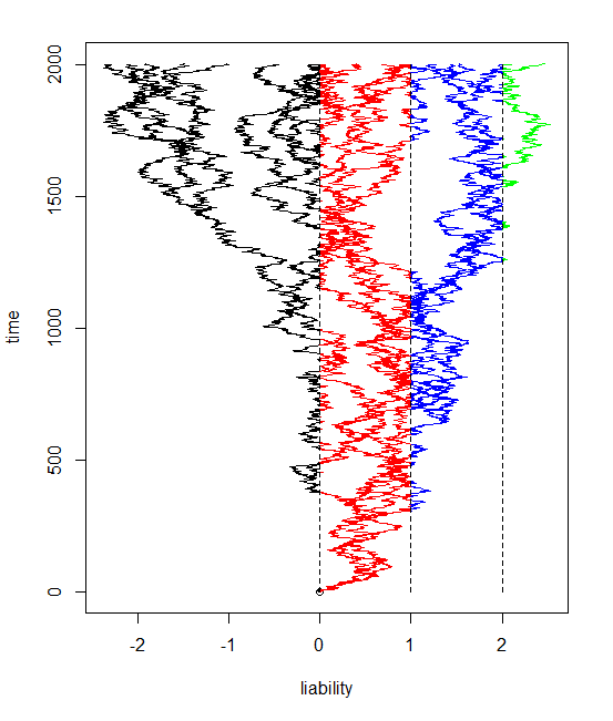
2012). My plan was to plot the color of each segment of evolution by the state implied by the value of the liability along that segment. This was straightforward for segments on either side of a threshold. The only difficulty was for segments crossing a threshold. The way I did this was by splitting the line segment into two and then plotting the part to the threshold in one color and the other part in the second. I interpolated the vertical location where the line segment should hit the threshold by just taking the fraction of evolution before the threshold (or after it) over the total amount of evolution in that generation. (I would have to standardize this by the time elapsed, but this is invariably 1 in a discrete-time simulation.)
I have incorporated the result into the function
bmPlot from before, just by adding a new input variable
type, which can be
"BM" or
"threshold". Code is
here.
The result is pretty cool - at least in my opinion. Here is some code simulating a twenty taxon tree and evolving the liabilities with three thresholds (and thus four possible states for the discrete character, encoded here as colors).
> tree<-pbtree(n=20)
> bmPlot(tree,type="threshold",thresholds=c(0,1,2),ngen=2000)
t1 t2 t3 t4
1.533271921 2.469110537 0.403391103 . . .
I have also added this function and
threshBayes to a new "non-static" (really, non-CRAN) version of phytools, v0.1-91, which can be downloaded (
here) and installed from source.
No comments:
Post a Comment
Note: due to the very large amount of spam, all comments are now automatically submitted for moderation.